Styling updates: Better or Worse? The All-Aussie edition

This is the second instalment of the Better/Worse/Not Much Different series, where Shannons Club members get to rate their favourite automotive re-styles.
In the first instalment, the debate was about American, European and British cars. And what a debate it was! Seems that everyone has a different opinion and is not afraid to voice it.
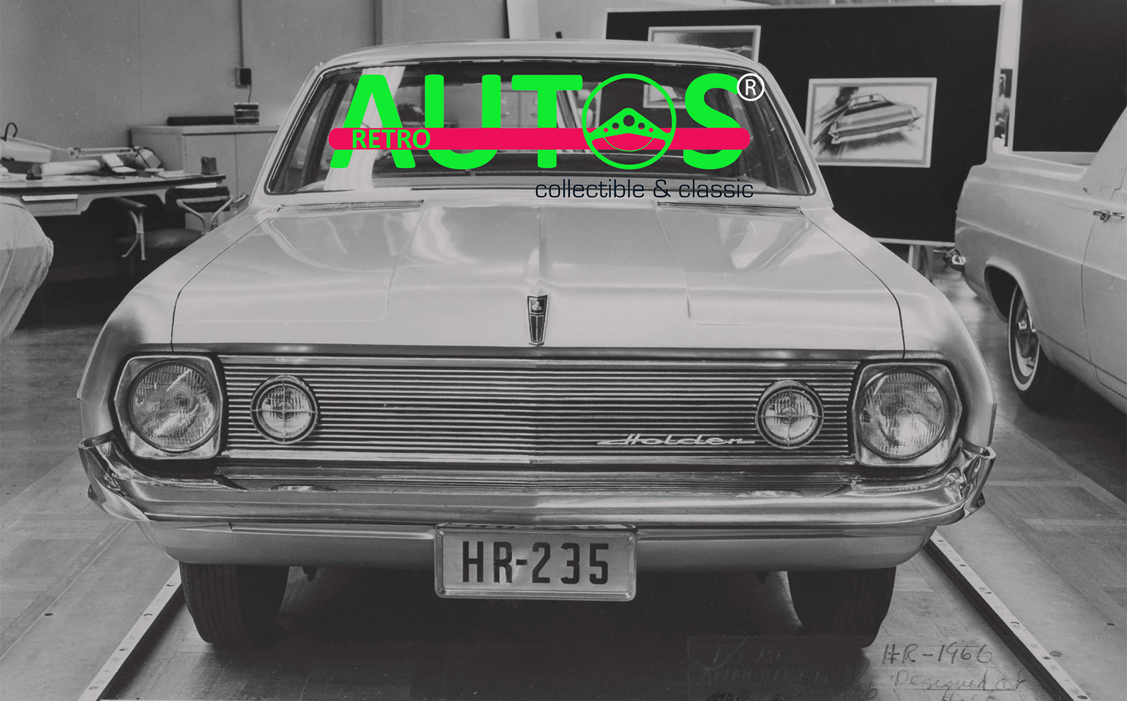
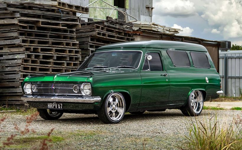
This time I’m rating a selection of All-Australian automobiles, including the much-debated 1965 HD and 1966 HR Holdens. The main photo (above) is just one of the initial styling proposals for the HR. It was photographed in 1964, two the years before it was launched as the face-lifted successor to the HD.
Feel free to join the discussion. Add your own All-Australian contenders so we can all vote!
XL and XM Falcon


The XL brought its “trim taut and terrific” shape to the market in August 1962. The XM followed in February 1964. The XM retained the XL’s doors and roof and combined it all with new sheet metal at the front and rear. I’ve always thought the XM looked like the front end was about to fall off, such was its drooping appearance. And the high placement of the tail lights just added to those visuals. So, for me, the XM is Worse.
Morris Major and Morris Major Elite


This is a hands down win for the Elite, which was developed as a one model replacement for the Morris Major and its Austin Lancer twin. The Elite’s wider grille and flashy side trim was a big improvement. So that’s a Better.

48-215 and FJ Holden


This will not make me popular, but I think the FJ’s grille is a mish-mash of bad ideas crammed into the space that once boasted an elegant and chromed rolling sculpture. And how about those little chromed fins on the FJ’s rear fenders. What were they all about? That would be a Worse for the FJ.
AP5, AP6 and VC Valiant
It is not often that a car maker will line up its current and previous models for inspection. They do not want you to compare the old with the new, lest you decide that the new model looks worse than the old one. But that’s what Chrysler Australia did in 1966. How helpful of them!

So, what do you reckon? Is the AP6 or VC better than the AP5, on which both are based? Me? I rate the AP6 as Better. It’s the American Valiant grille that does it for me. Check out that the VC is coded AP7 in this pre-release factory photo.


HD and HR Holden

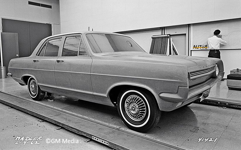
Yes, I know you were waiting for this comparison! Everyone has an opinion about the HD/HR, even almost 60 years after the HD was released. Many have fallen for the urban myth that the HR was a “Hastily Re-styled” HD. Trouble is, GM’s and Holden’s archives contain images that show the HR shape was being formed 12 months before the HD was released. Anyway, I do not rate the HR as Better. Give me the HD with its front fenders any day.


P5 LTD and P6 LTD

The P5 LTD is too much of an elongated Falcon for me. The P6 LTD, with its big razor-edged fenders and look-at-me Rolls-Royce grille is a definite Better. There was once a new P6 in my family’s driveway, as evidenced in the photo, hence I know all about these fabulous luxo limos.

VE and VF Valiant


Many say the VF is Better than the VE. Not me. I’m sticking with what Chrysler’s global design boss, Elwood Engel, approved back in 1965 when the 1967 Dodge Dart, on which the VE is based, was being styled. Within the VE’s crisp lines, minimal chrome adornment and vertical conclusions to the front and rear fenders can be found Engel’s 1961 Lincoln Continental. So, does that mean the VF is Worse? No. I rate it Not Much Different because it still appeals to me, just less so than the much-underrated VE.
XR, XT and XW Falcon


The XW re-style was so good that many thought it was a totally new car. Not so. Just a very clever re-shape of the XR/XT by Jack Telnack and the late Brian Rossi. From its Mustang inspired grille to the recessed back window and muscular rear end, the XW heralded the arrival of what Ford called “the great Australian road car”. I showcased the XW in a previous Retroautos. There’s a link at the end of this story for those who want to see the previously secret styling proposals and read what Jack has to say about how the car went from design to driveway.

I rate the XW as Better than the XR/XT. But, what about the XR versus XT? That’s easy. The XT is Worse. But only the 500 model. What causes me to dislike this specific model? Well, it is that strip of chrome along the waist line. It looks so cheap. The base model Falcon and Fairmont escaped this kitschy bit of metal, to their advantage. The comparison photo of the maroon XR Fairmont and gold XT makes the point.

Morris 1100 and Morris 1500

The 1100 was not meant to be a styling winner. Its panels were there to protect the car’s technology from the elements and maximise passenger space. Job done, then!

In 1969 the small design team at BMC Australia gave the 1100 a re-fresh. Top management gave them no money for any major modifications, but they were able to add a power bulge to the bonnet (to accommodate the taller new taller E-series 1.5 litre engine), create a wider and reshaped grille, fit flush door handles and smooth out the rear fins. Overall, the car looked more integrated than anything the designers in the UK had ever tried to achieve. Definitely Better.
HK and HT Holden

I have an up-close knowledge of these two. In September 1969 my family had both models, Kingswoods, in the driveway.

Holden straightened the beltline on all four door HT sedans (cost constraints meant it was not applied to the wagons) and widened the rear pillars and roof line on the Belmont and Kingswood. They were trying to emulate the seamless flanks of the Monaro coupe. All they succeeded in doing was creating a large expanse of uninteresting sheet metal behind the rear doors which made the Belmont and Kingswood look too heavy for their rear wheels.

The beltline changes were ok on the Brougham and Premier, because their Cadillac-esque roof line remained intact. Then there was the HT’s grille. It was Holden’s attempt to replace metal with plastic. It looked cheap. It looked woeful. At the rear, the HK’s fabulous variable length tail lights and reflectors were reduced to the same non-descript lights. All sedans were given the HK Brougham’s boot lid.


My verdict: Worse for the HT Belmont and Kingwood sedan. Not much different for the Brougham and Premier.
VH to CM Valiant


As with the HD Holden, everyone has a definite opinion about the VH Valiant. I like it, but I also like what the styling team did with the later models. The best of all is the CL. The revised rear end and big bold grille suited the Valant’s “fuselage” shape. The CM was an almost indistinguishable-re-fresh. Better for the CL.


HQ and HJ Holden


While the HQ’s sheet metal was fluid and elegant, like a stone smoothed by a fast-flowing river, the HJ appeared as if it had been chiselled from a rock quarry. But don’t blame the design team for the HJ. It was the senior executives who wanted a bolder “Chevrolet” look. The bean counters got involved, too. They wanted to reuse as much of the HQ as possible to keep costs down and profits up. That’s why the bumper bars were straight and the tail lights located in a hole hacked out of the rear fenders. It was simple and cheap. The outcome was a fall in sales. No surprise that it’s a Worse. And I’ve more to say about the HJ’s journey from design to driveway soon in Retroautos.


XA, XB and XC Falcon

The April 1972 edition of Wheels magazine described the XA Falcon’s styling as “an appealing half-way house between the big car look of the Valiant and the smaller, chunky appearance of the HQ Holdens.” It was the first Falcon not based on an American design. The styling team of Jack Telnack, the late Brian Rossi, Allan Jackson and John Doughty, all barely 30 years of age, showcased what could be done in Australia. You can read more about the XA in my Retroautos design to driveway story. There’s a link at the end of this story.

What of the XB? It is Better, no doubt about it. By grafting the 1971-72 Mustang’s aggressive front-end theme onto its four-door family sedan, Ford Australia created a stunning profile. Sales boomed. Indeed, the XB became Ford’s biggest selling model, ever. Dealers saw 211,306 exit their showrooms.


As for the 1976 XC versus the XA? The profile was significantly altered by straightening the belt line. This was done to link visually with the upcoming 1979 XD. It looks fine to me, and better than the HT Holden. But I just wish they’d not “chunked up” the front end. They lost that exclusive Mustang mystique. It is not worse than the XA, but not better either.
Finale
There are so many more I could have included, such as the FE and FC Holden. But I had to stop somewhere. Do you agree with my ratings? What other restyles deserve a mention?
Here are the links to the XW Falcon story and the first instalment of this series. A special thanks to Nairn Hindhaugh for supplying the images of BMC Australia cars, and to Shannons Club members FFalcon and 120934 who created the idea for the series.
Retroautos is written and published with passion and with pride by David Burrell. Retroautos stories and images are copyrighted. Reproducing them in any format is prohibited. Retroautos is a registered trademark.

