It is fifty years since I walked into the Holden dealership in my town and saw the HQ Monaro coupe.
Even in 1971, a new Holden was still big news across Australia, and where I lived was no exception. The dealer’s showroom was packed with people inspecting the cars. Some were opening doors, bonnets and boots. Others were sitting on the seats and checking out the airy interior. Most, like me, were standing back admiring the smooth surfaces, while waiting our turn to clamber in and out of the cars.

The sales staff were busy selling the virtues of the HQ. “It is a milestone car” I overheard one tell a prospective buyer. It is an apt summary of the HQ.
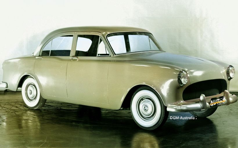
Up until the HQ’s release in July 1971 all previous Holdens were essentially based on the original 48-215, especially in terms of the underlying engineering platform. Not the HQ.
Its svelte shape clothed a new semi-perimeter frame chassis. In the rear, coil springs replaced the old-fashioned leaf type. Front quarter windows were eliminated because the HQ now had flow through ventilation. The ancient under-dash handbrake was tossed away in favour of a floor mounted arrangement.

The HQ range featured a wide and deep open-mouthed grille, which angled back and dropped below the headlight level. This was a significant breakthrough from previous Holdens which featured rectangular shapes of die-cast metal and plastic stretching fender to fender, book ended by headlights. The lights were encased by the front sheet metal and not really part of the grille at all.
The thin curving A pillars would come to define the HQ and set a visibility benchmark that has endured into the 21st century. These were Holden designer Phillip Zmood’s idea, conceived partly as a way to meet proposed government regulations that mandated the thickness and strength of A pillars on cars sold in Australia.

Despite the engineering challenges, Holden’s chief body engineer, the inventive Reg Hall, found a way to meet these regulations and Phillip’s design. Although the regulations were never implemented, Holden went ahead anyway and the HQ’s unobstructed forward vision remains a benchmark.
Accentuating the freshness of the HQs design were the long “blisters” that ran across the wheel arches. These also appeared on the 1971 Pontiac LeMans and GTO.
Another “new” styling idea was the trapped bonnet. This had been around for at least a decade in the USA. Used on the HQ it gave stylists the scope to shape the front end without having to worry too much about how to integrate the leading edge of the bonnet into the grille design. It also allowed easier and less costly facelifts.

The design team also nailed the sheet metal to tyre proportions to perfection. From the rear, especially, the fenders cut under the body line to expose the tyres and give the car a purposeful stance, even on narrow crossplies.
The sedan looked great but new shape was so much more svelte on the coupe. The local dealer showcased the two door’s lines by placing a LS model in the centre of the showroom under two bright spotlights. Stunning and gleaming in iridescent Baroda Silver Mist, it boasted a white (Flax) interior and redline tyres. People stood two deep around it.

In his fabulous book Monaro Magic, author Dr Norm Darwin writes that it took more than 1100 of Holden’s staff over three years to progress the HQ range from design to driveway. Work began in January 1968, just as the HK was being launched. Holden’s Design Director, Joe Schemansky, led the overall styling efforts while day to day work was in the hands of John Schinella, the Assistant Design Director and his two deputies, Peter Nankervis and Phillip Zmood. A young Paul Beranger was also involved in the program, as was Eugene Mori, Chris Emerson and Peter Arcadipane. The interior was in the hands of Jack Bergin and Paul Tasteos. In 1969 when Schinella returned to the USA, his role was taken by Leo Pruneau.

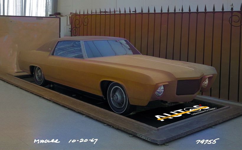
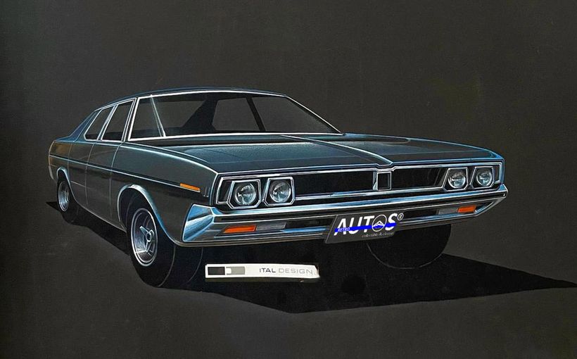
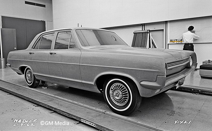
The sedan was shaped first. There were two initial proposals. One resembled the 1967/68 full sized Chevrolet and Pontiac, combining a very prominent Coke-bottle belt line with a Pontiac-style split grille and tail lights set in the bumper bars. The second car was more formal with a straight belt line. It resembled a 1970/71 Buick Skylark sedan. A link to my Retroautos edition featuring the development of the HQ sedan and Statesman can be found at the end of this story.

While the two proposals were being considered, a number of sketches and tape drawings of the coupe were completed but no full-sized clay models were constructed. Holden needed the coupe to fit into the sedan design, with the minimum number of panel differences, so it had to wait until the sedan was agreed.
Neither of the two initial HQ proposals captured the imagination of the team nor Holden executives. By looking further ahead into GM’s future line ups they gained some new ideas and out of a series of sketches and full-sized clay models the overall shape of the HQ began to emerge in mid-1968 and the real work on the coupe could begin.


There was no question that the HQ Monaro would be a pillarless hardtop. Phillip Zmood created a number of tape drawings, all with eye catching DLOs (day light openings) and rear window shapes. One stood out. It boasted wraparound glass and an almost vertical C pillar. It was Phillip’s way of paying homage to the 1953 Studebaker Starlight coupe, designed by Bob Bourke. Ironically, Bob’s younger brother, Bill, just happened to be the boss of Ford Australia right at that time.

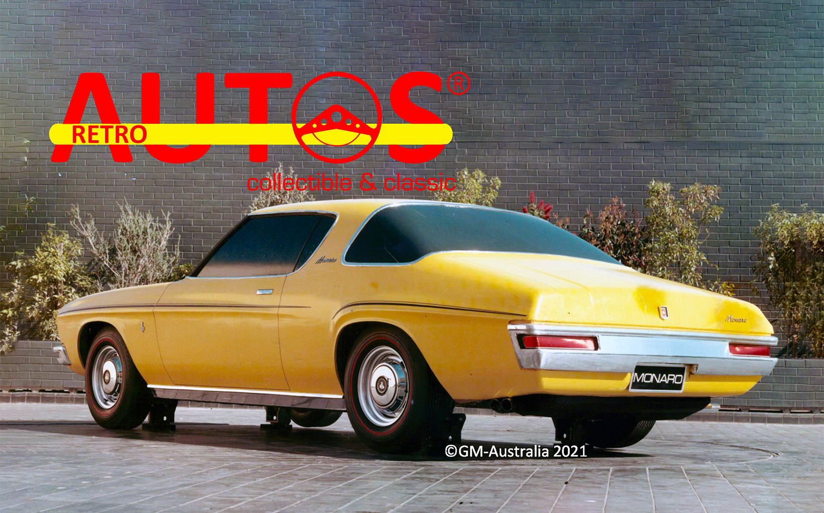
A two-sided clay model was created to demonstrate different side body ideas. Resplendent in yellow, the left side had the HQ sedan’s horizontal “blisters” stretched over the wheel openings. On the right side the rear blister curved around the wheel opening, providing a significant visual difference to the sedan. Go-fast stripes on both sides accentuated the blisters.
To further differentiate the Monaro from the sedan, the tail lights were horizontal strips embedded in the bumper bar.

In July 1968 GM’s International styling studio in Detroit also offered two alternative coupe ideas that featured a thick fixed B pillar, similar to the forthcoming Colonnade mid-sized cars. It never went further than a tape drawing.


In July 1969 Leo Pruneau arrived from Vauxhall where he’d spent the previous five years overseeing the HB Viva and other models. Later that same year Phillip Zmood was promoted to the Torana studio as Chief Designer and was given responsibility for managing the LH Torana program. Peter Nankervis took his place leading the HQ design program.
As with all design programs, cost implications, sharing of components and technical constraints had to be taken into account. The coupe lost its horizontal tail lights and unique side blisters. The large wrapped rear window would undergo a number of re-shapings until a version which was technically and financially feasible was agreed.


The production version of the coupe honoured the original Monaro’s stand-out styling features. The smooth transition of the roof into the rear quarter panels and the continuous flow of the roof line into the boot give the car an enduring elegance.


The HQ range captured considerable media attention when released. It was Modern Motor magazine, however, which set the benchmark. In conjunction with Holden’s public relations team, they developed a sound recording on a small-diameter record which showcased the HQ range. It was given away with each copy of the magazine along with a booklet.

The record was the equivalent of a 21st century podcast, with dramatic sound effects and Modern Motor Editor Rob Luck throwing a 350 V8 Monaro down the quarter mile, calling off the speed and times, as the microphone picked up all the noise and gear changes. TV personality and model BoBo Faulkner commented on the interior design. The background music sounded like it had escaped from a cigarette advertisement and the golden tones of Kevin Golsby could be heard on the voice over. Those were the days!

The HQ coupe was replaced by the HJ in October 1974, with the final version being the luxury LE in 1976. Then the coupe was gone, not to return to Australian roads until 2001. And then in 2006 it was gone again.
For me, the HQ Monaro coupe ranks as one of the top three shapes ever to emerge from an Australian automotive design studio. It has a timeless quality that still draws my attention. It is why a photo of the HQ GTS coupe accompanies the Retroautos trademark on this website.
To read the story about how the HQ sedan went from design to driveway please click on this LINK. Retroautos is written and published by David Burrell with passion and pride. Thanks to John Field and Richard Ferlazzo who opened the photo files at Holden’s design studio.

