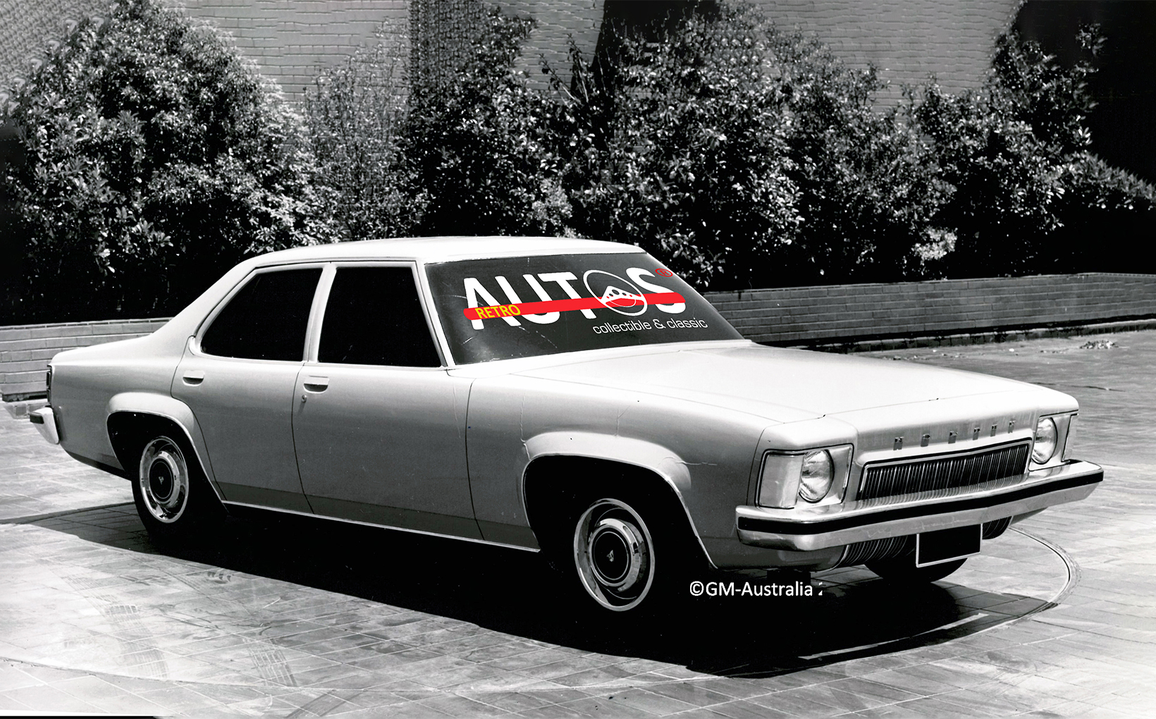
Few regard the HJ Holden with fondness. Its journey from design to driveway is a brutal reminder of what happens when strategic decisions are delayed and cost cutting goes so deep that it impacts the styling and appeal of the product being sold. Buyers go elsewhere.
The numbers tell the story. During the HJ’s production run, from October 1974 to July 1976, Holden’s market share slipped to 25% and average monthly sales dropped 30%. Its minimally changed HX successor continued the downward trend.


It is not possible to talk about the HJ without first considering the fate of the never released HV. In a recent edition of Retroautos, I wrote about the HV. That story can be found by clicking on a link at the end of this story. In the meantime, here’s a brief refresher.
Holden’s original plan was to replace the HQ with the HV in early 1973. The plan was devised during a time of economic uncertainty, when large wage increases, high inflation and interest rates of nearly 10% were creating significant cost problems for businesses in Australia. Holden was also experiencing additional problems. From commanding 50% of the market in 1958, it had slipped to 32.7% at the end of 1971. Cheap imports, Ford, Chrysler, Toyota and Datsun had all been eating away at its position.


While the market share decline was bad news, it was the sales figures that shouted out the brutal facts. Between 1963 and 1970 the overall local market volume had surged by 33%. Holden’s sales had not kept pace, increasing by only 6.6%. Holden was falling behind and would continue to do so without close attention to its product offerings. But in the economic situation that Holden faced, cost savings would take priority over product.

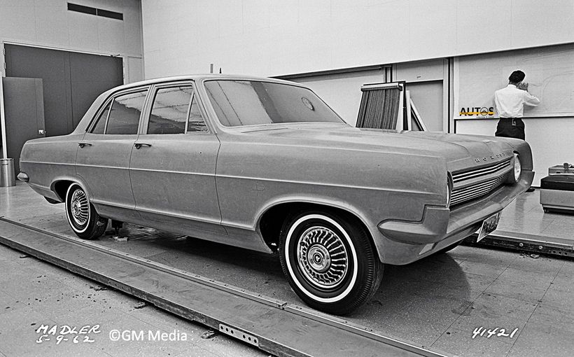
The HV was to be an evolution of the HQ’s smooth lines. That all changed when Holden’s senior decision makers were given market research that claimed the HQ looked too “soft” compared to the much squarer Valiant and Falcon. They started discussing a transition to an angular styling theme, assuming it would be more appealing to car buyers. These discussions went on for months and months with no resolution and the HV’s launch date was delayed.


Finally, in late 1971, the top managers made up their minds. They took the strategic decision to cancel the HV. A new program was instigated, coded HJ. The styling would move to a squarer appearance, reflecting themes of the current Chevrolet range. The release date was set for October 1974, almost 18 months after the HV’s original planned release, leaving the HQ in the market for almost three and half years.
Indecision and delay always have consequences. Holden’s market slid to 30.4 % by the end 1973. Worse was to come.

Enter the bean counters
The HJ’s Holden’s initial design team included Leo Pruneau, assistant design director, and Peter Nankervis, chief designer of the Holden studio. Joe Schemansky was the design director. By the end of November, 1971, the first of a number of full-sized HJ clay models had been developed. Ironically, a few of the HV’s styling elements would be reused.

In April 1972, Holden’s managing director, A.G. Gibbs, sent a report to GM’s group vice president Elliot “Pete” Estes, confirming the HJ program. A covering letter signed by Holden’s chief engineer, G.R. Roberts, accompanied the report:
“This submission is now based on proposals resulting from a complete review of the Holden 'HJ' Program taking into account the comments from Product Planning Group in New York and also our requirement to fix the deficiencies of the 'HQ' Model. Whilst the timing has been revised for Styling, no change is to be made to the new introduction date as the program has been reduced in overall content.”
Three things jump out from this letter. First: Holden was obviously being given advice from GM in the USA about the HJ. Second: I wonder what the “deficiencies” of the HQ were? The styling? Third: when Roberts writes that “the program has been reduced in overall content”, it means that money had been cut from the HJ’s development budget. In simple terms, the opportunity to make significant and meaningful sheet metal changes were lost two years before the HJ was released. The future was now determined.
In May 1972 there was a management change in the styling department. Leo Pruneau was transferred to the USA and his place was taken by Richard “Dick” Finnegan. Leo would not return until June 1975, as design director, when Joe Shemansky retired.

In my Design to Driveway book series Peter Nankervis recalled the HJ program.
“We did higher boot lids, horizontal and vertical tail lights, different wheel arch shapes, smooth body sides, body sides with a strong high ‘bone line’, differing grille shapes and narrow and wide bumper bars.”


As the HJ development moved forward, Holden started to really feel the combined financial impact of rising costs, its market share decline (down to 30.4% in 1973), sliding local sales and the new Labor government’s decision to reduce import tariffs by 25% in mid-1973. At the same time, the LH/LX Torana program was well underway. It too needed to be funded.
All of this meant that the finance managers were advocating the reuse as many of the HQ’s panels as possible to cut costs. Peter summarised the situation:
“All change costs money and the more things are changed the more it costs. To evaluate the visual impact of using carryover panels we played around with so much, searching for what would work within the budget parameters of the time. For example, we did one clay model with a HQ front fenders and smooth rear quarter panels.”


Tail light placement was a typical casualty of enforced cost reductions. Leo had wanted to raise the visual height of the HQ’s rear end, which he always thought looked too droopy. Various vertical and horizontal proposals were deemed too expensive. The money saving solution was to hack out a section of the HQ rear fenders and fill the gap with wrap around lights. More money was saved because a simple bumper bar could now be used in place of the HQ’s more complicated version.


At the front, the HQ’s recessed grille was replaced with a sharp-edged design. The turn indicators were lifted from the bumper bar and placed on the leading edges of the fenders. This allowed the front bumper bar to be simplified, much to the delight of the bean counters.

The HJ’s bonnet was re-shaped to integrate with every new grille across the range. This saved more money. Peter explains the issues the designers faced:
“We had to make sure that every model’s grille was interchangeable so it was easy to manufacture, met the bonnet’s ridge lines and yet they all had to look different, especially the Statesman.”


With so much money needing to be saved, the HJ’s final shape was reduced to being the HQ’s body shell, doors, front fenders, rear fenders and the elegantly thin A pillars, plus the squared-off front, plain bumper bars, new tail lights and a revised interior. In many ways, it resembled a smaller version of an early seventies Chevrolet, especially the Monte Carlo.


The lack of money also resulted in the Monaro coupe, station wagon, utility and panel van retaining the HQ’s sheet metal from the windscreen back.


Being the flagship model, the budget for the Stateman and new Caprice allowed them to gain a new boot lid and tail lights. The overall idea was to give them more of a Cadillac appearance. The purpose of the Caprice was to compete with Ford’s new LTD, but that was more of an aspiration than a reality. Consideration was given to lengthening the Stateman’s wheelbase but there was no money to invest in such a low volume vehicle.


The HJ also saw the end of the imported 350 cubic inch/5.7 litre Chevrolet V8, which meant the Monaro 350 disappeared from the line-up. Gone too was the base level coupe, signaling the beginning of the end for locally built two door cars, until the Monaro’s return almost 30 years later.
HJ Legacy
There is no doubt that the HJ is not as well regarded as the svelte HQ nor the HZ, with its radial tuned suspension. That said, it ranks higher than its minimally changed successor, the HX. That’s scant praise. Reflecting the HX’s minimal styling differences, the model’s design studio files contain only about 20 photos, the least of any Holden I’ve researched.


We will never know if the softer visuals of the HV would have been more appealing to car buyers than the angular HJ. What we do know is that the market research used to justify the strategic decision to cancel the HV program ultimately proved to be wrong.
And what was the impact of the cost cutting that the bean counters demanded and restricted the HJ’s styling changes? Once again, the numbers point to the answer. Holden’s market share slumped to 25% during the HJ’s (and HX’s) production run and the 1977 annual report recorded a financial loss.
When I wrote my Design to Driveway book series in 2018 and 2019, I observed that the HJ’s legacy is a visual reminder of what happens when strategic decisions are delayed and over-zealous cost cutting constrains a car’s journey from design to driveway. I have not changed my mind. And it is much the same for the never released WA, a story soon to be told in Retroautos.
Click here for the Retroautos HV Story.
Retroautos is written and published by David Burrell with passion and with pride. A special thanks to Peter Nankervis. Retroautos’ stories and images are copyrighted. Reproducing them in any format is prohibited.

